Internet, quietly,
from low orbit.
- Dates
- Feb — Mar 2026
- Kind
- Self-directed study
- Tools
- Next.js · Tailwind
- Subject
- Starlink marketing
This is a redesign of Starlink's marketing homepage, done on a weekend because I found the subject interesting. It is a study, not a pitch. A fleet of refrigerators in low orbit has to behave like a boring ISP by the time the packet reaches your laptop — and I wanted to see what the page would feel like if the design respected that quietness rather than shouting over it.
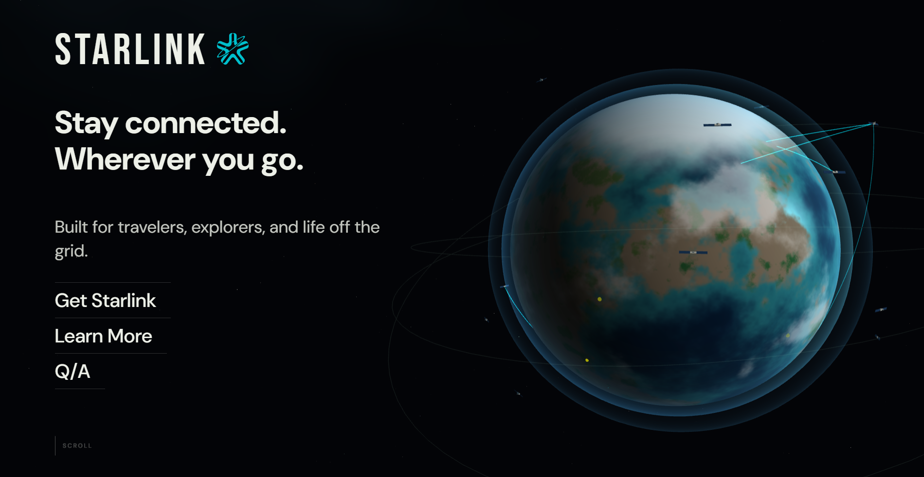
01The hero, without the hero video.
The current Starlink page opens on a rotating globe and a video of a rocket. Both are beautiful. Neither tells you what Starlink is, what it costs, or whether it works where you live. The redesign opens on one sentence and a horizon.
02Numbers, with dates.
Every number on a satellite-ISP page is either marketing or a measurement. The difference is whether it wears a date. I gave every number a timestamp. If the page is served in June with Q1 figures, it says so.
Every number on a satellite-ISP page is either marketing or a measurement. The difference is the date.
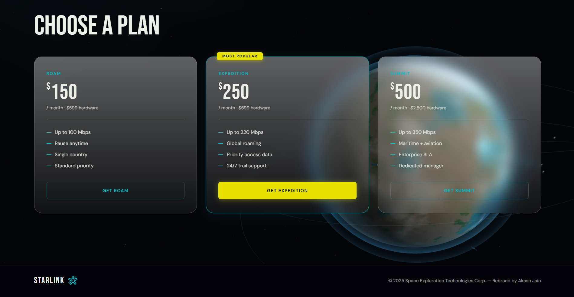
03Three plans, priced honestly.
The current page walks a user through plans via a carousel. Carousels hide information. Three plans fit on one screen at most viewports. They rank by what the user actually cares about in order: speed, latency, data, hardware.
04What's missing, on purpose.
No hero video. No rotating globe. No neon. No "coming soon" badges on plans that are already available in most states. The horizon strip is a plain CSS gradient with a few pixels of white for stars — it loads in zero bytes beyond the stylesheet and says more about Starlink than three seconds of rendered motion. The dark mode is paper-colored, not terminal-black, so the design language reads as continuous with the rest of my journal, not grafted on.
05Why this page.
Because the subject has held my attention for two years and I wanted to hold a version of it in my hands. That's the only honest reason to do work like this. It's a sketch of a building I liked, done on a weekend, shared because I liked how it came out.
Not affiliated with SpaceX or Starlink. All numbers are illustrative for the purposes of this study.